My Community Festival 2022
Client: My Community
Agency: Heilo
Service: Festival Branding
Illustrations: Chan Yi Jun / Heartknots_
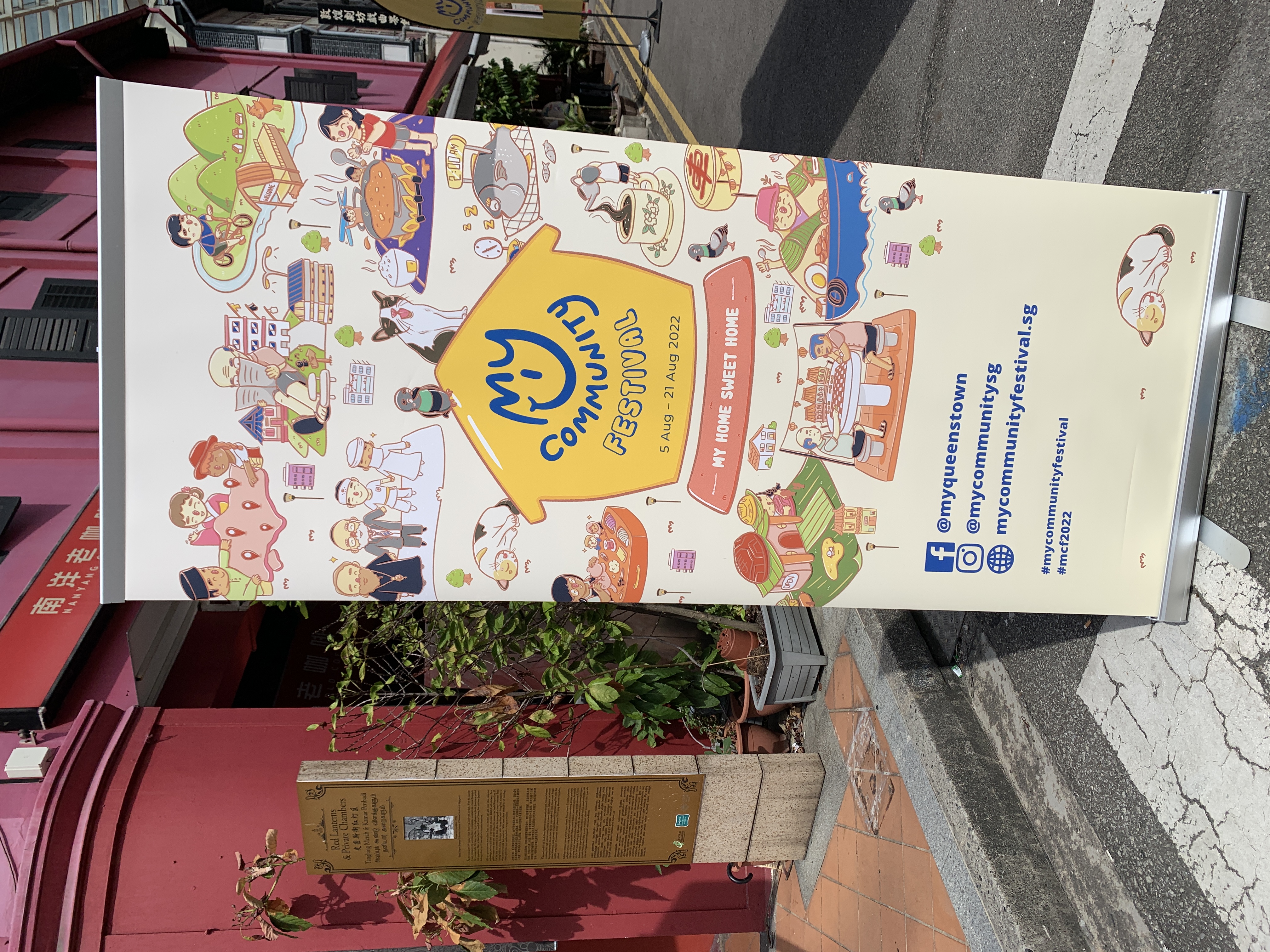
Key Visuals
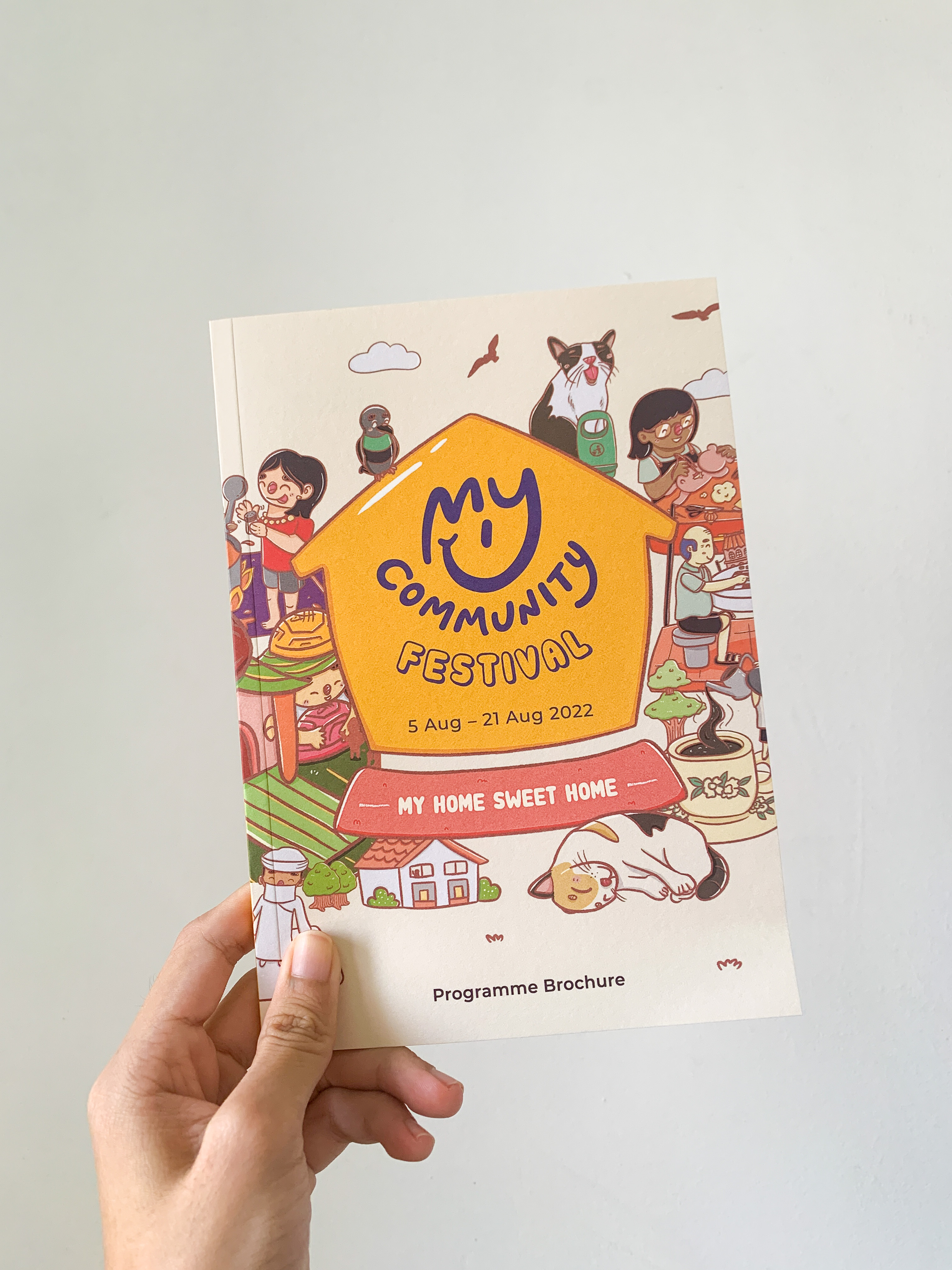
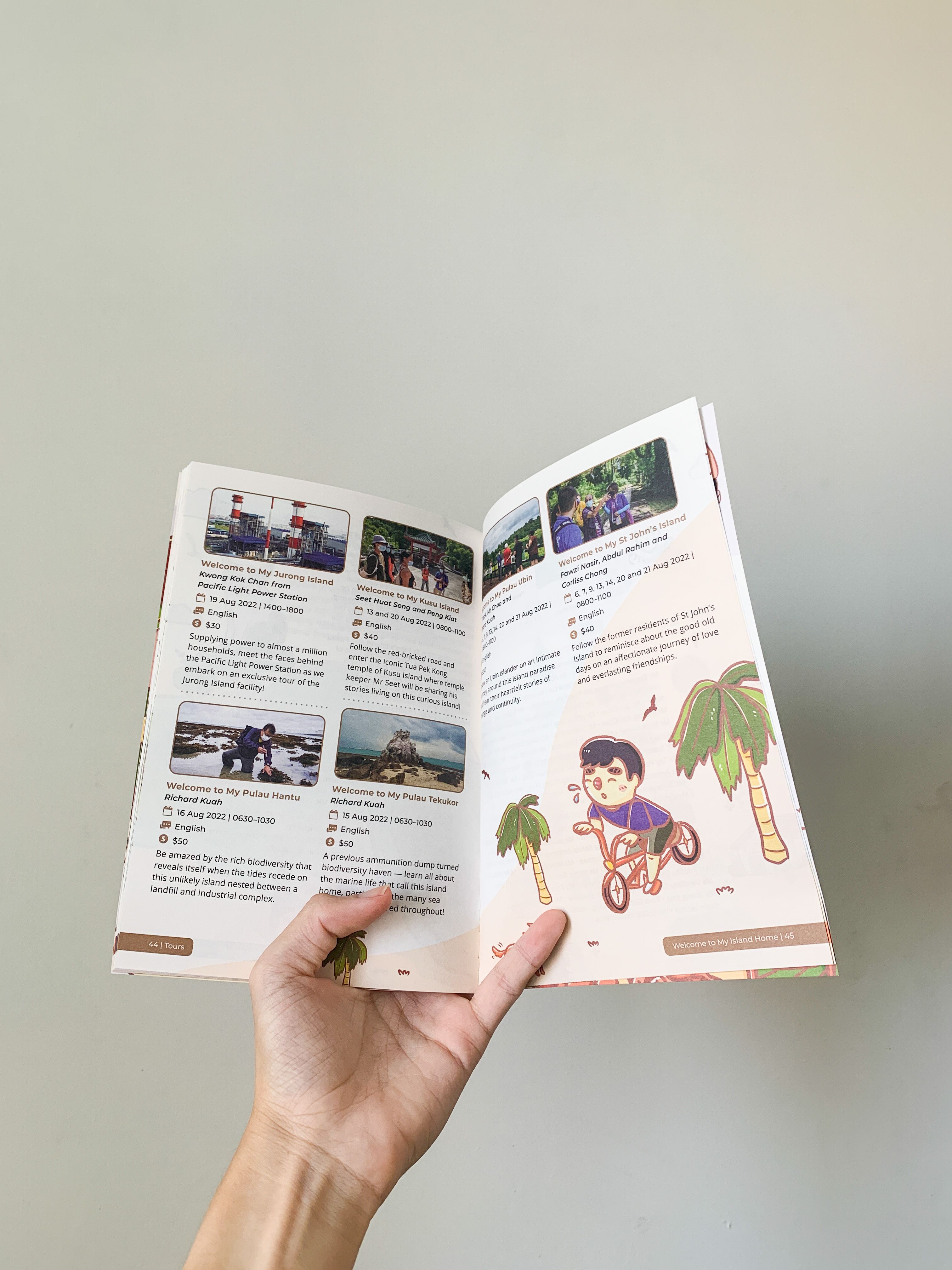
Festival Programme Brochure
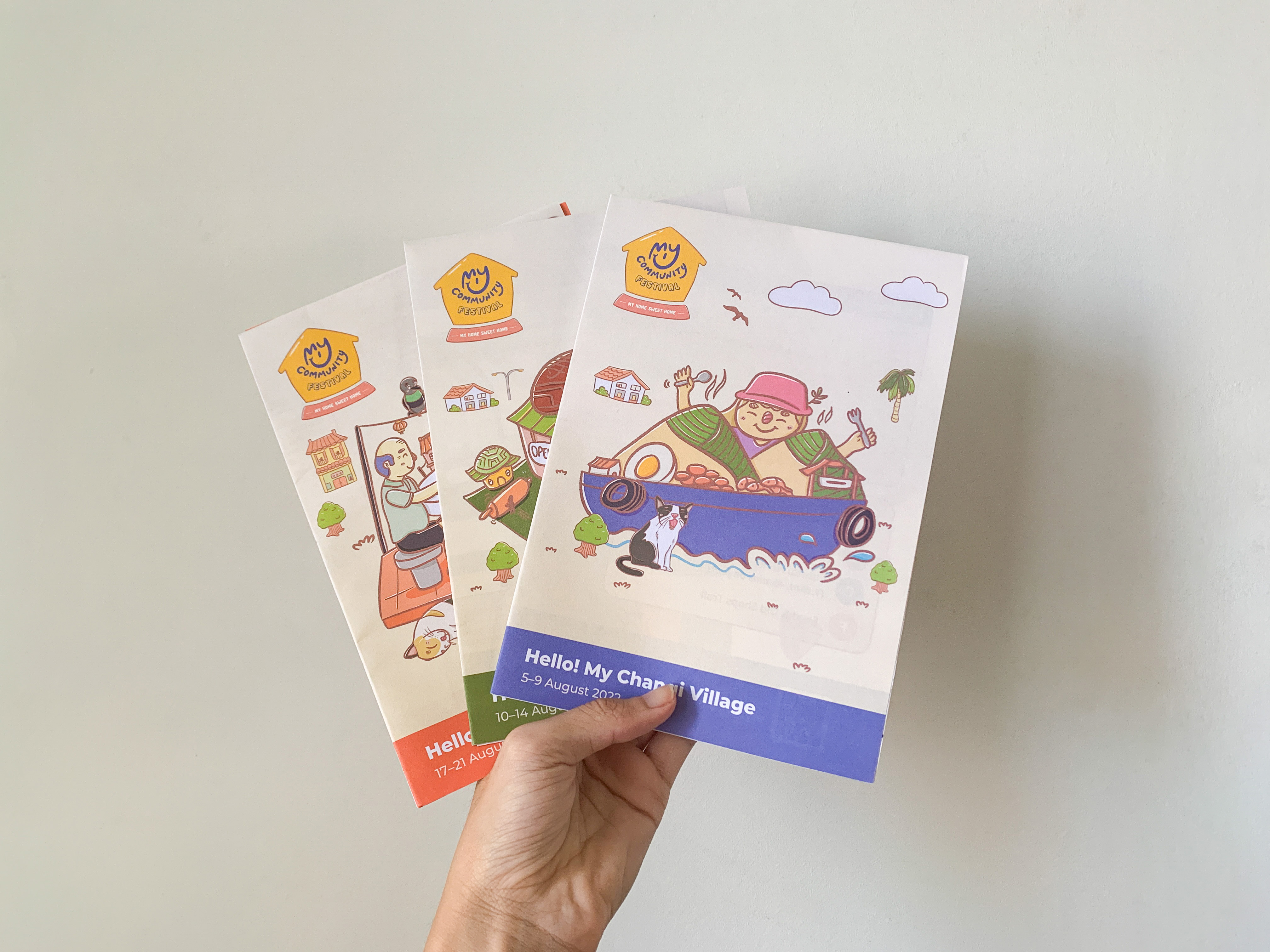
Map Brochures
Website
Social Media
Client: My Community
Agency: Heilo
Service: Festival Branding
Illustrations: Chan Yi Jun / Heartknots_
Key Visuals
Festival Programme Brochure
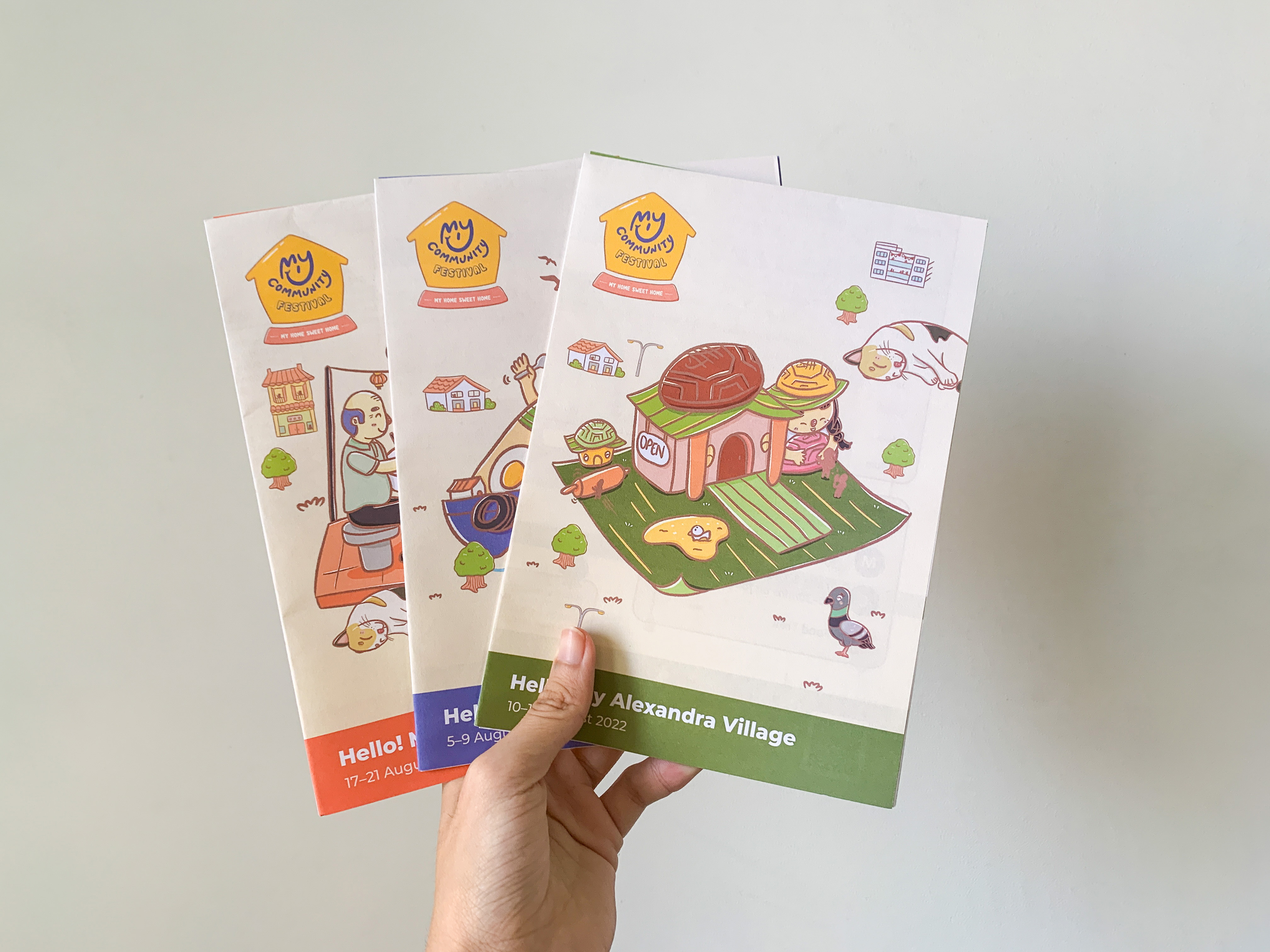
Map Brochures
Website
Social Media
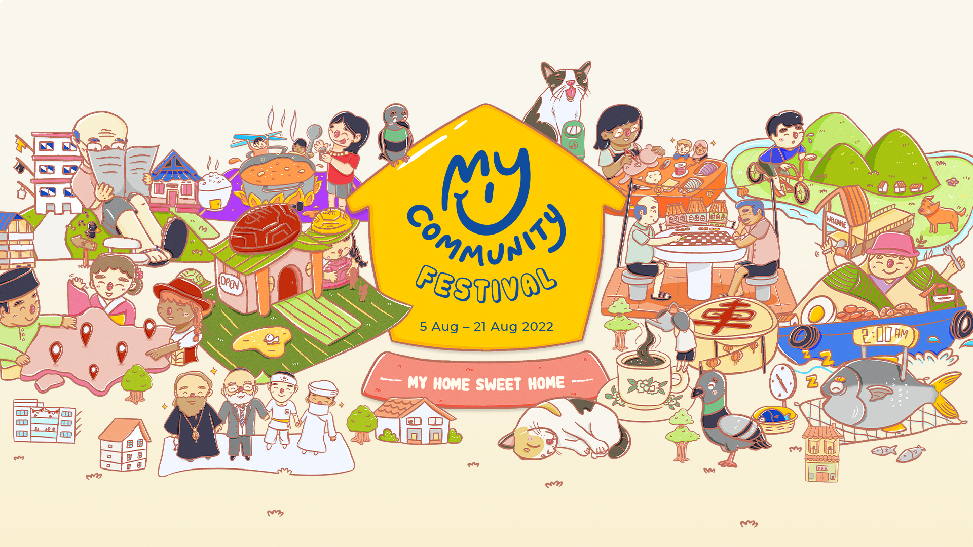
In 2022, We’ve got an amazing opportunity to create the event graphics for My Community Festival 2022.
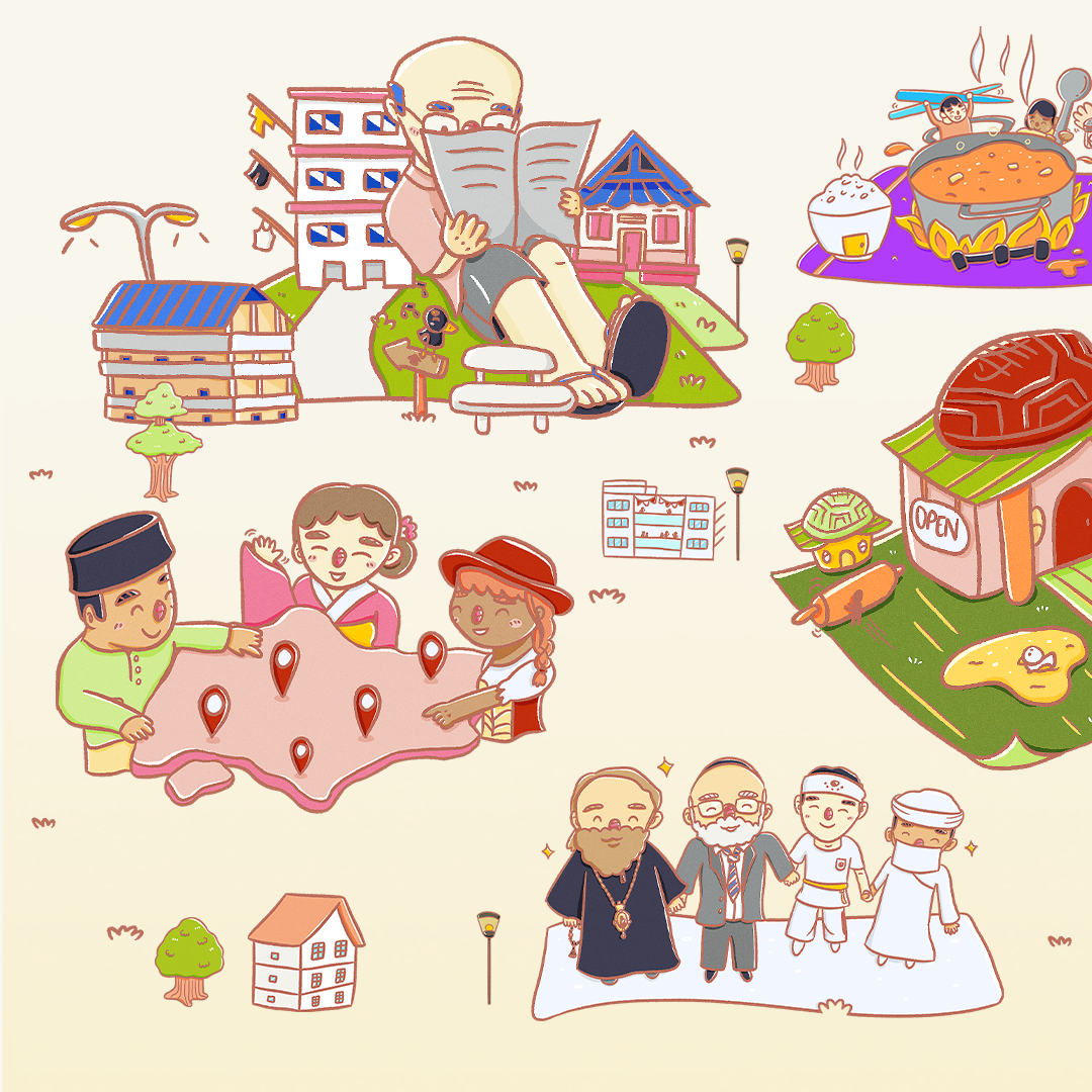
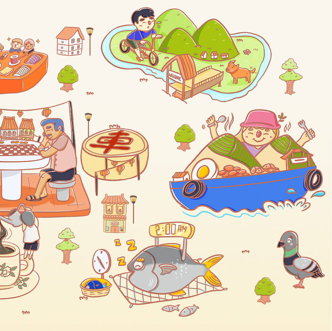
The illustrations are specially curated according to the programmes with a local touch. Through a better understanding of the programmes & histories, these illustrations communicates familiarity and a sense of warmth as we bring these Singapore culture & stories to the people.
These illustrations are then adapted across the event collaterals; both online & offline—social platforms, festival brochure, map brochure, website & etcs.
Check out event site here / E-brochure here.
Key Visuals

Festival Programme Brochure
Social Media

Map Brochures — Hello! My Lovely Neighbourhood
Hello! My Changi Village, My Alexandra Village & My Chinatown
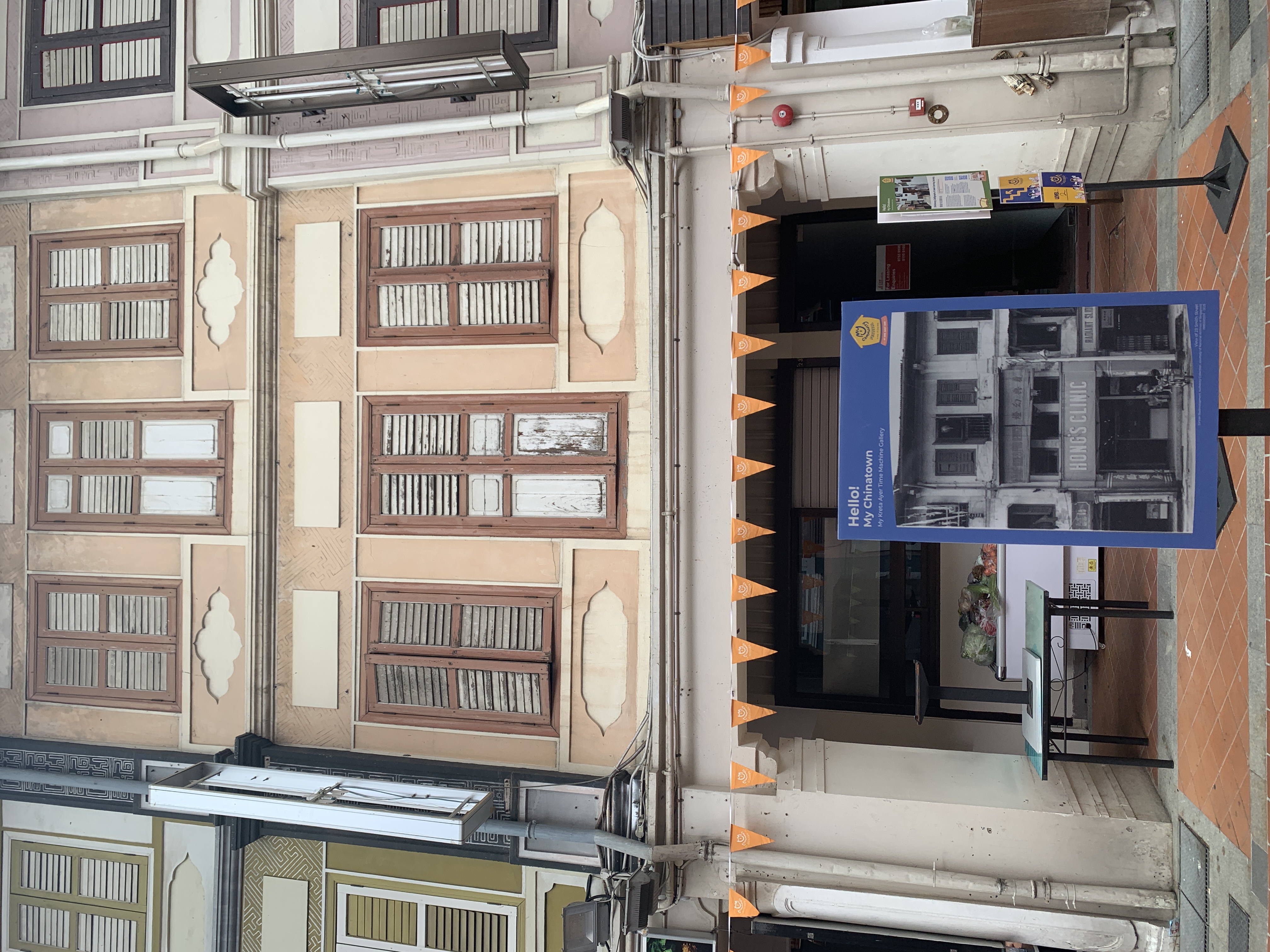
Event Space
Here are some snapshots that I took when I went down to one of event—Hello! My Chinatown
and explored the different programmes hosted.

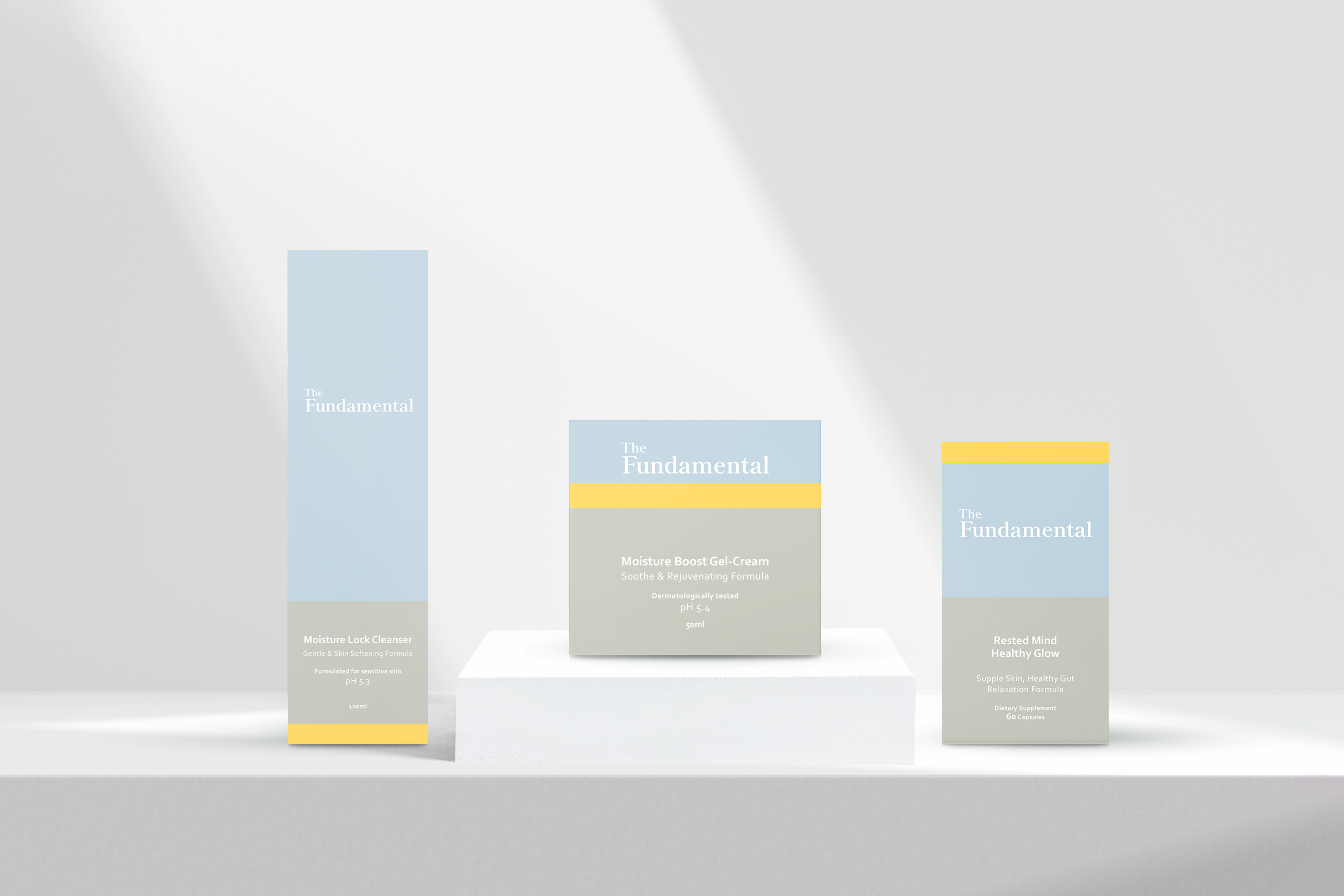
The Fundamental
Client: BButterfly
Agency: Delitier & Co.
Scope: Branding
Brand Identity
Brand Literature
Brand Collaterals
Website
Client: BButterfly
Agency: Delitier & Co.
Scope: Branding
Brand Identity
Brand Literature
Brand Collaterals
Website
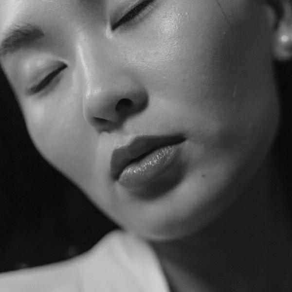
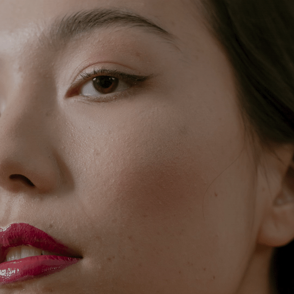
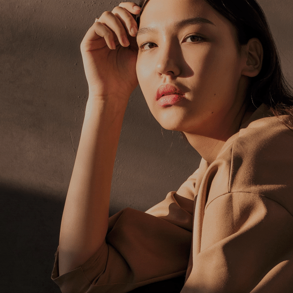
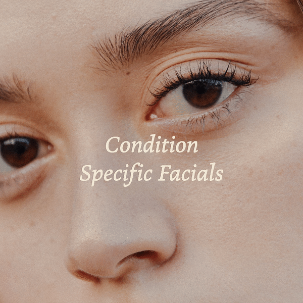
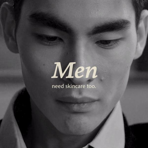
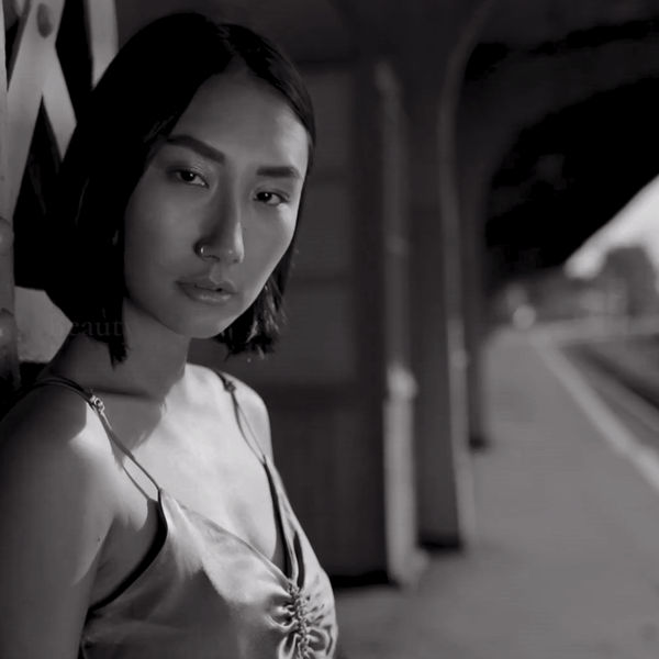
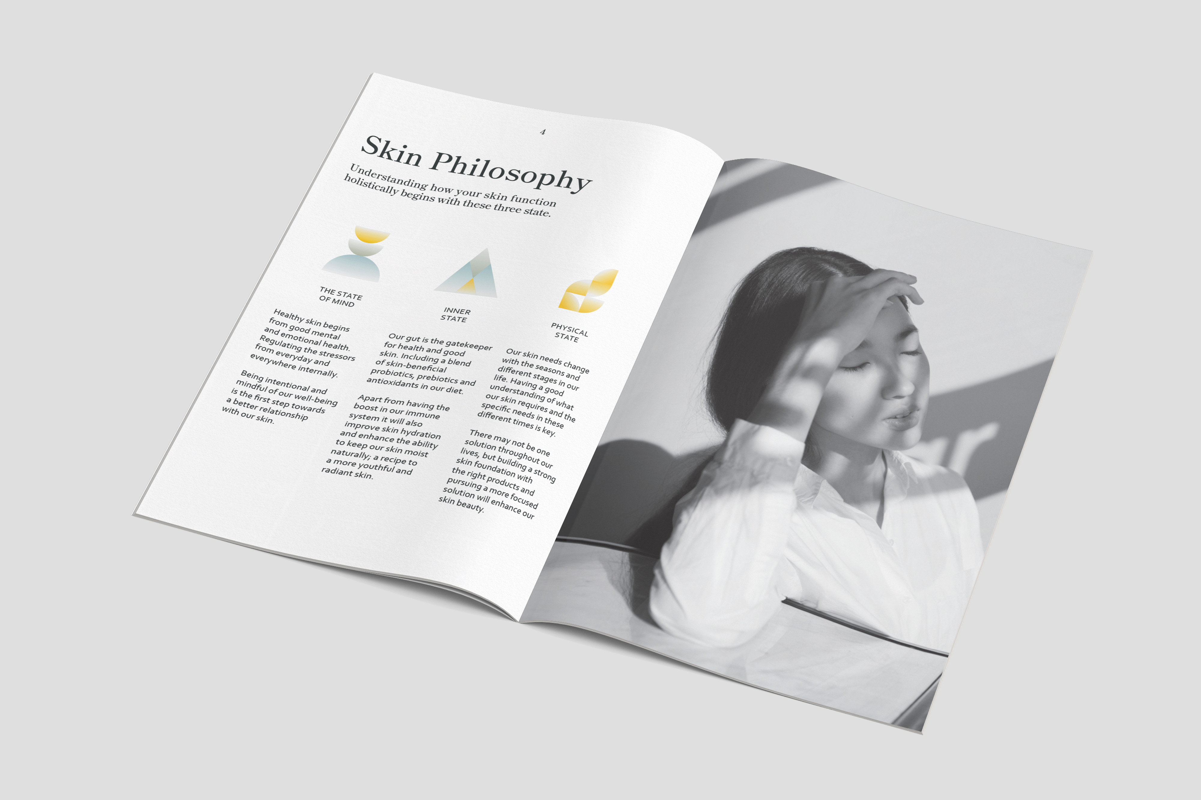
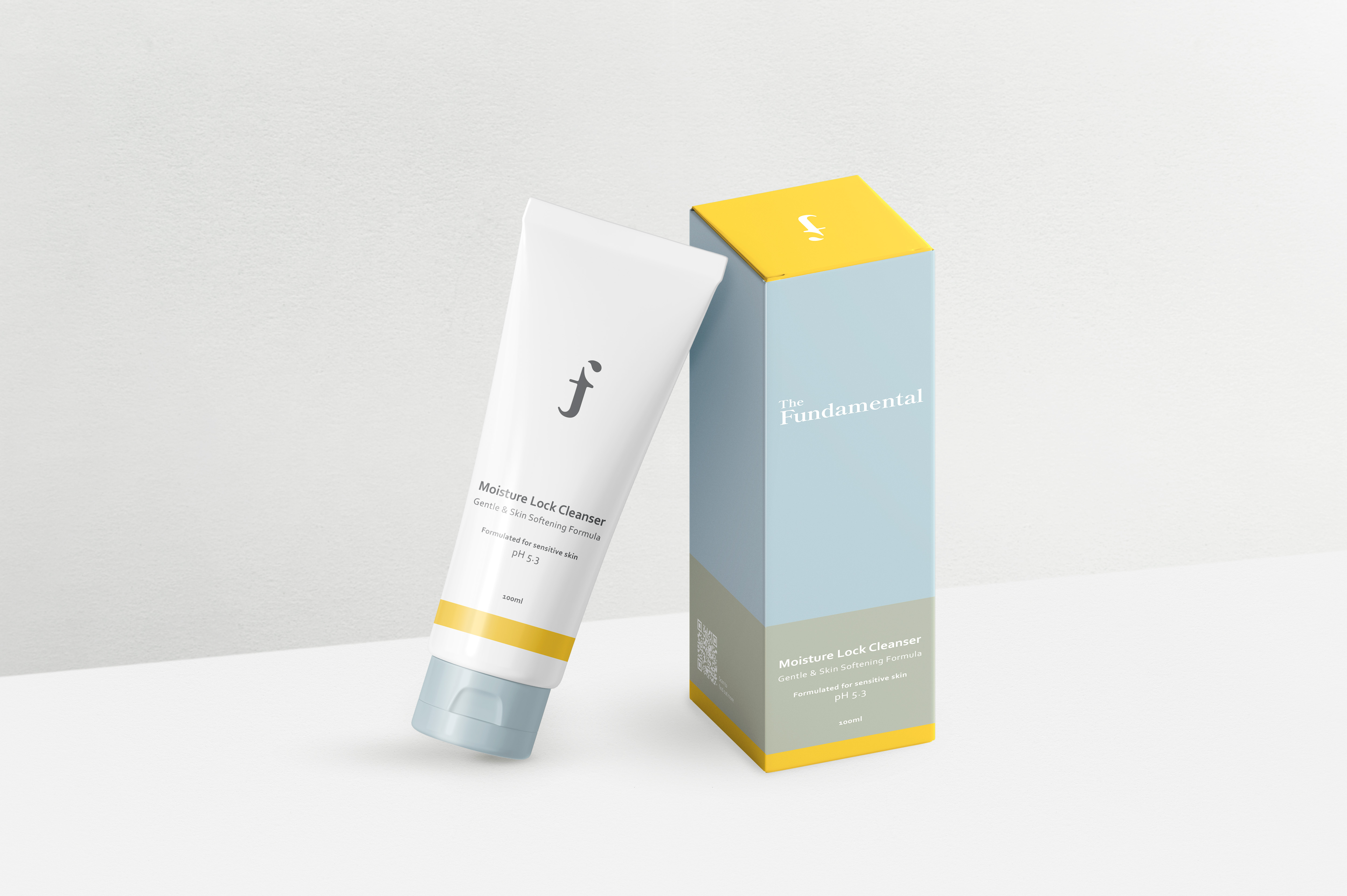
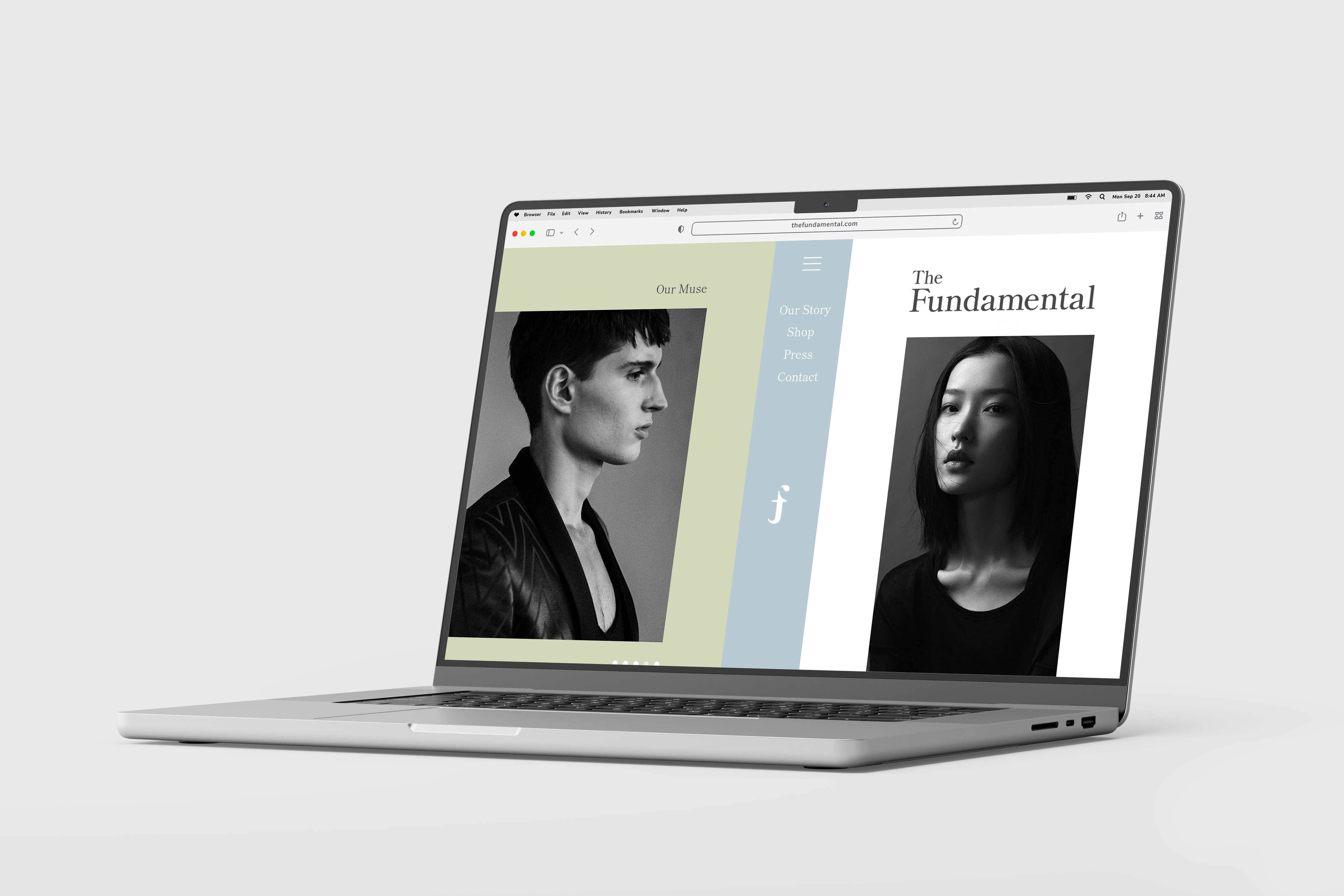
BButterfly engaged us to develop a cohesive brand identity for The Fundamental, a new skincare line designed for time-starved Asian city dwellers seeking simplicity without compromise. Rooted in the philosophy “For Asians, By Asians,” the brand champions the idea of reconnecting with your bare skin—a return to honest, essential care in a world of overwhelming choices.
Our approach emphasized cultural relevance, minimalist design, and purposeful storytelling. From brand name, tagline, logo to packaging, every element was crafted to evoke clarity, calm, and quiet confidence. The result is a refined identity that speaks to modern consumers looking for skincare that’s intuitive, effective, and meaningfully made for them.
Our approach emphasized cultural relevance, minimalist design, and purposeful storytelling. From brand name, tagline, logo to packaging, every element was crafted to evoke clarity, calm, and quiet confidence. The result is a refined identity that speaks to modern consumers looking for skincare that’s intuitive, effective, and meaningfully made for them.


A PIXELS
Client: A Pixels Production Haus Pte Ltd
Agency: Delitier & Co.
Scope: Rebranding & Social Media Creation
Brand Identity
Brand Literature
Social Media
Brand Applications
Client: A Pixels Production Haus Pte Ltd
Agency: Delitier & Co.
Scope: Rebranding & Social Media Creation
Brand Identity
Brand Literature
Social Media
Brand Applications
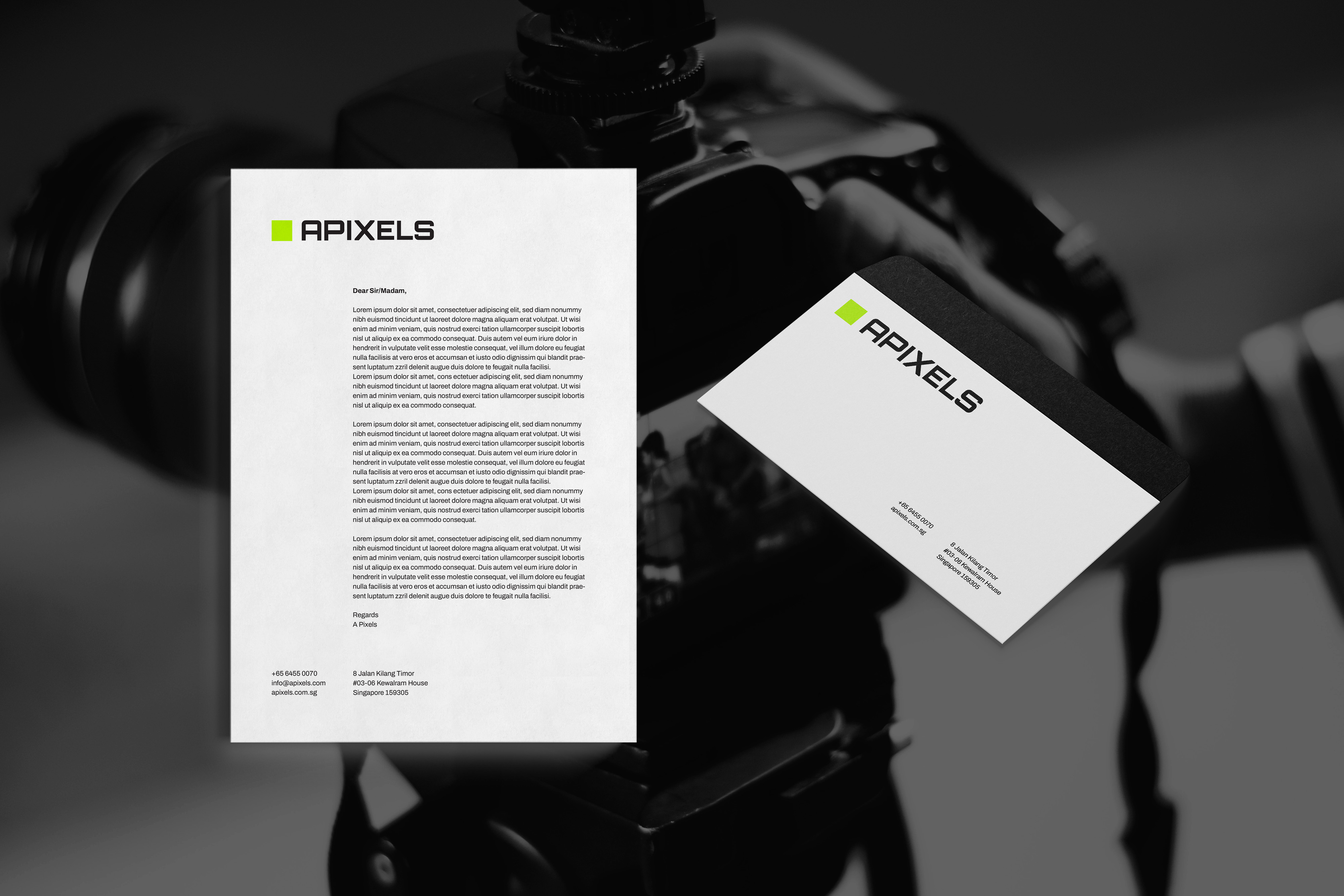
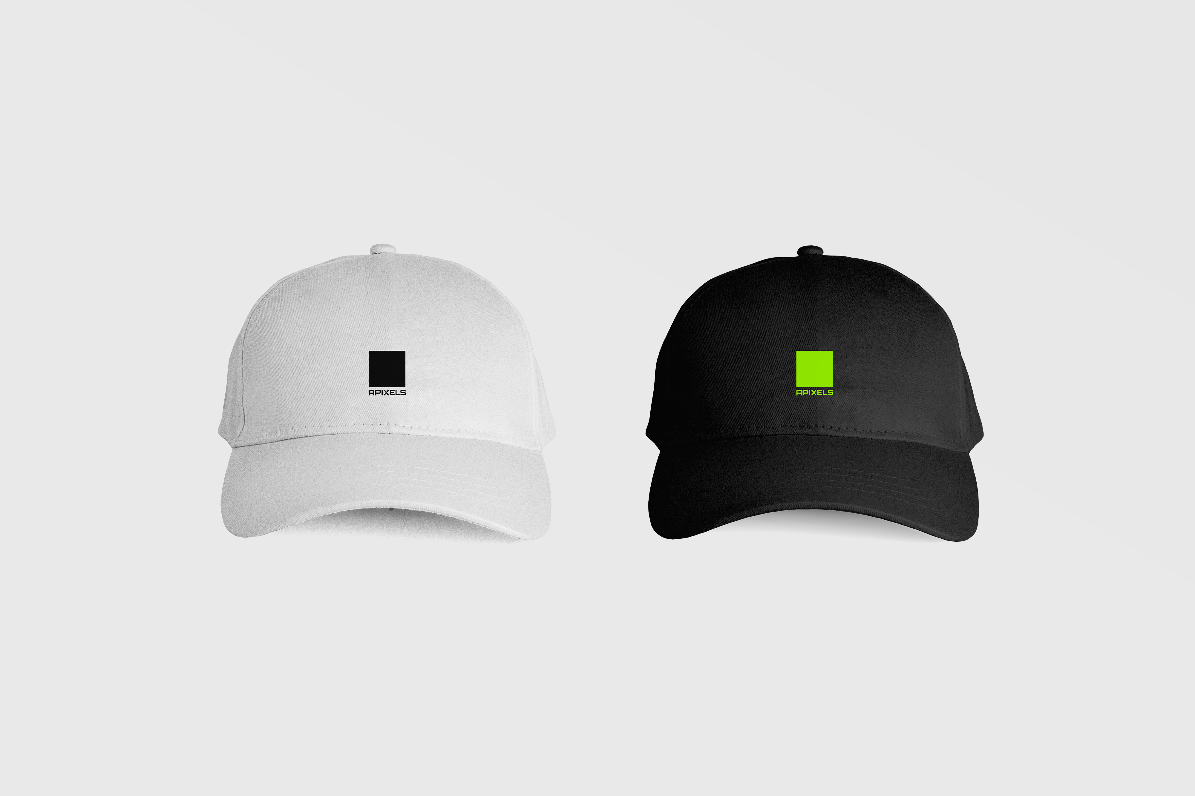
We had the privilege of leading the rebrand for A Pixels, transforming their identity into one that exudes boldness, creativity, and modernity.
With a focus on refreshing their image, we crafted a brand that balances fun and innovation while maintaining their professionalism and creative spirit. The new look and feel speak confidently to their vision, showcasing their dedication to bringing ideas to life with passion and precision.
The project covered every aspect of their rebrand—from brand literature and logo design to online elements like web design, PowerPoint decks, and social media marketing posts. We also worked on offline materials, including brand collaterals, shirt designs, van designs, and even planning for their studio. This comprehensive approach ensured a cohesive and impactful brand presence across all platforms.
Check out their new look in their website & instagram .


JM Flower
Client: JIMEI
Agency: Delitier & Co.
Scope: Rebranding & Social Media Strategy
Brand Identity
Brand Literature
Social Media Strategy
Brand Applications
Client: JIMEI
Agency: Delitier & Co.
Scope: Rebranding & Social Media Strategy
Brand Identity
Brand Literature
Social Media Strategy
Brand Applications
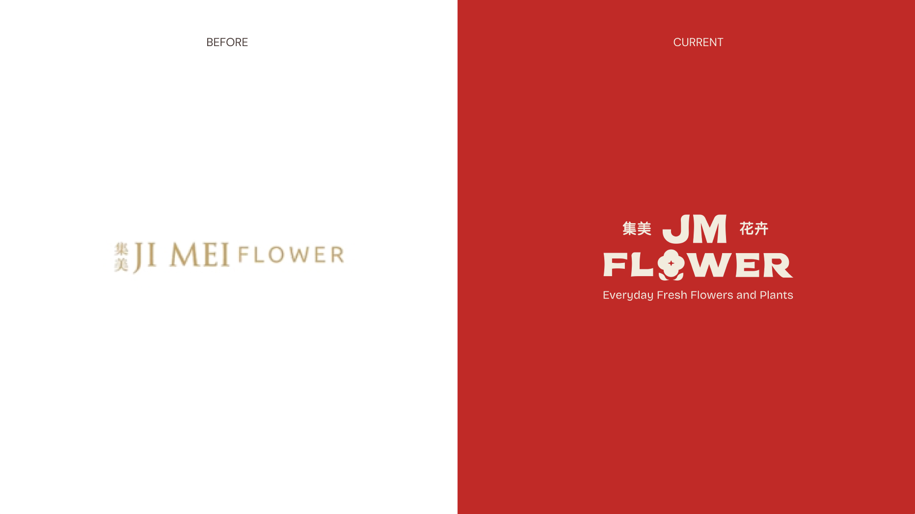
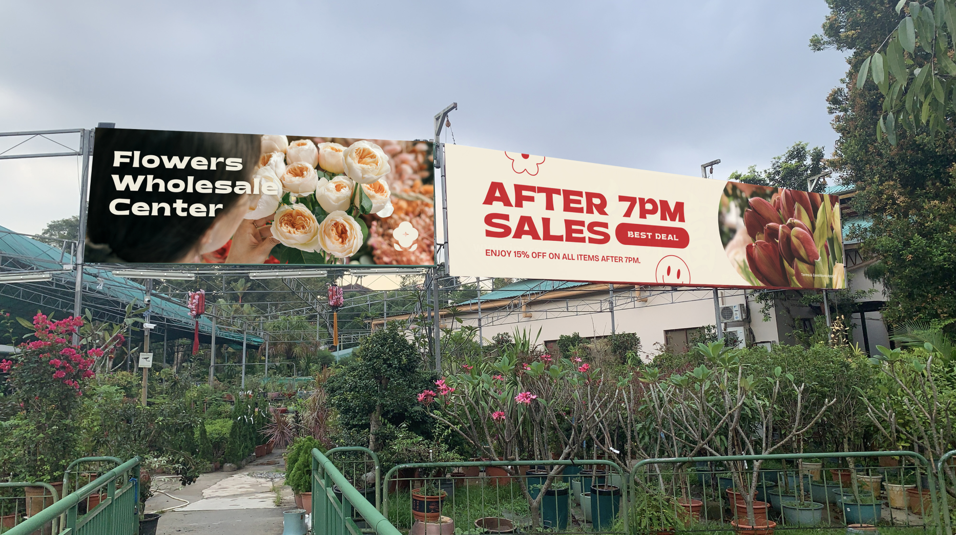
We partnered with JIMEI to lead a strategic rebranding initiative focused on restructuring their brand architecture to improve clarity and customer engagement. The solution was the establishment of two distinct consumer-facing brands — JM Flower and JM Creation — while the JIMEI brand was repositioned to operate solely as a backend wholesale entity.
I played a key role in developing the new brand identity for JM Flower, aimed at attracting everyday customers shopping for fresh flowers and plants in supermarkets across Singapore. The goal was to create a modern yet approachable look that resonates with younger audiences while still feeling familiar to older generations.
Recognizing that supermarkets are often saturated with a variety of visual stimuli, we chose red as the primary brand color — a bold and strategic choice that stands out amid the clutter while complementing the natural tones of the floral products.
The result is a refreshed, inviting identity that enhances brand recall and evokes a sense of vibrancy and warmth, setting JM Flower apart in a competitive retail environment.
Ji Mei
website .
JM Flower
website & instagram .
JM Creation
website & instagram .


Haach
Client: Haach
Year: 2022 — 2023
Agency: Delitier & Co.
Service: Social Media, Content Creation
Social Posts
Client: Haach
Year: 2022 — 2023
Agency: Delitier & Co.
Service: Social Media, Content Creation
Social Posts
We’ve created monthly social media content for Haach to create brand awareness for its brand and improve the social media feed. To reach out to its audiences and educate them on the brand.
Check out the works we’ve done for their social here.
Check out the works we’ve done for their social here.